SKUP Logo Design – Nike & Foot Locker Collaborative Branding
When two global brands become one visual identity
Early 2020 brought an extraordinary brief: Nike needed a completely new logo representing their collaboration with Foot Locker for an internal training rewards program.
Not a Nike logo. Not a Foot Locker logo. Rather, a unified brand identity symbolizing partnership between two retail giants, designed to motivate, recognize, and reward Foot Locker’s sales staff (Stripers) mastering Nike product knowledge.
This Nike Foot Locker logo design project demanded more than graphic design skills. Instead, it required strategic thinking about how visual identity supports retail strategy, training culture, and employee engagement.
The strategic challenge
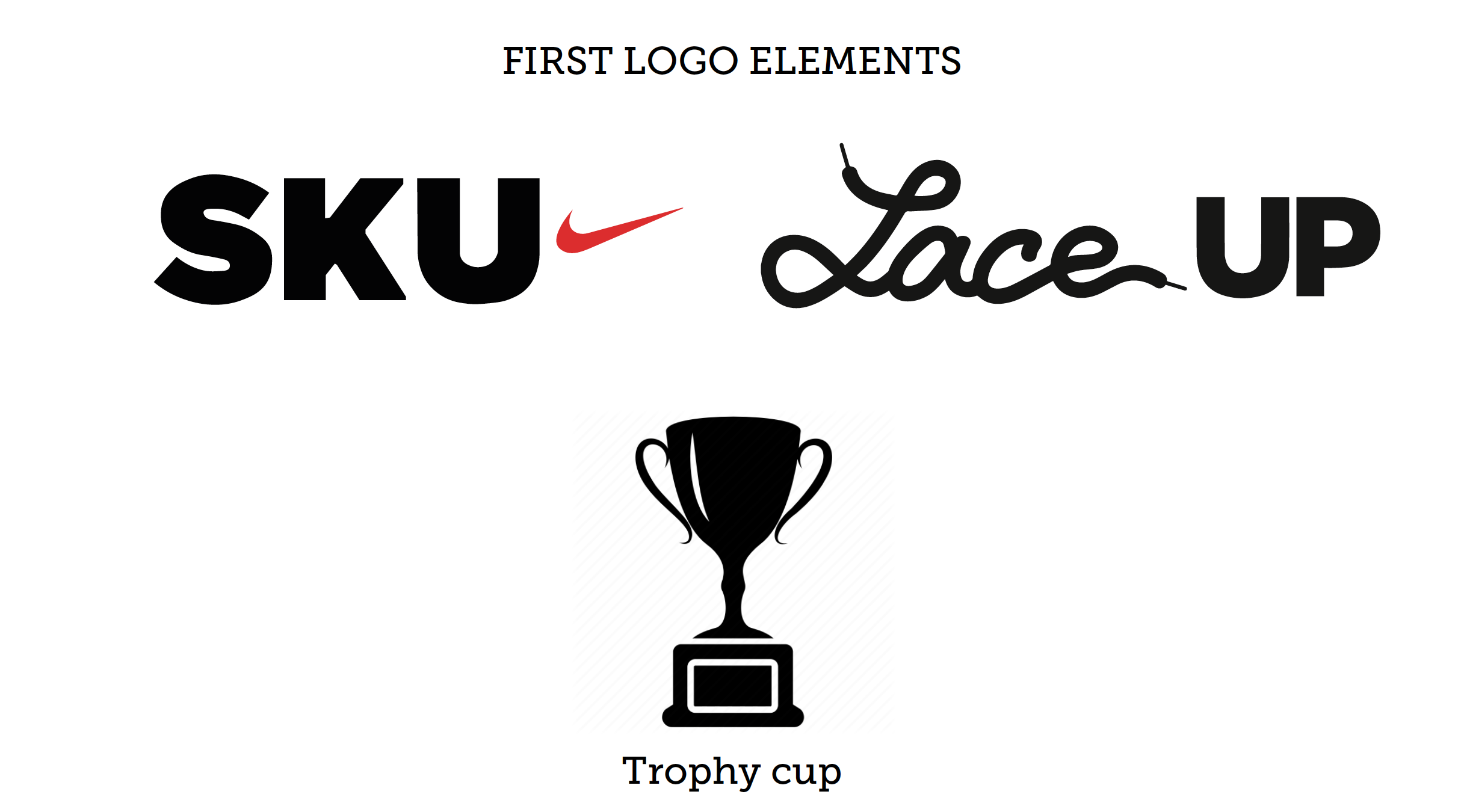
Nike and Foot Locker each operate robust internal training platforms. Nike’s SKU system educates retail partners on product details, technology, and storytelling. Foot Locker’s Laceup platform trains their Stripers on sales excellence across multiple brands.
For Nike products within Foot Locker stores, these platforms needed integration. Consequently, both companies sought unified training initiative with distinct identity, separate from parent brands yet clearly connected to both.
The program required naming and complete visual identity. Moreover, it needed reward merchandise that Stripers would actually want to earn and wear. The corporate logo design had to work across digital training platforms, physical merchandise, and communication materials.
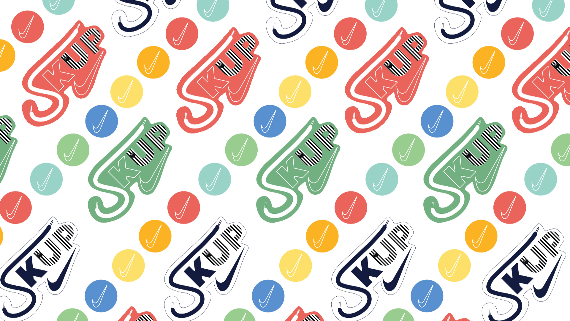
Creating SKUP: strategic naming and identity
Our solution began with the name itself.
SKUP fuses Nike’s SKU platform with Foot Locker’s Laceup system, a linguistic marriage reflecting the program’s collaborative foundation. Moreover, SKUP phonetically echoes “cup”, evoking trophies, competitions, achievement. The name simultaneously references both parent systems while suggesting reward and recognition.
Perfect strategic naming creates multiple meaning layers. SKUP achieves this elegantly.
Logo design bridging two brand worlds
Designing the SKUP logo required balancing dual brand identities without diluting either.
Nike’s design language is performance driven, dynamic, technically precise. The swoosh represents motion and achievement globally. Foot Locker’s visual identity is bold, urban, with referee stripe heritage, strong typographic presence and distinctive black, white, orange palette.
Our SKUP logo needed to feel authentically both without being literally either. Consequently, we created dynamic visual identity that captures Nike’s performance energy through form and movement, references Foot Locker’s bold graphic confidence through treatment, stands independently as training program brand, and works seamlessly alongside both parent logos.
Typography, color, form: every design decision balanced the partnership. The result reads as collaborative rather than compromised, a third brand born from two, not awkwardly splitting difference between them.
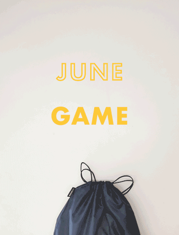
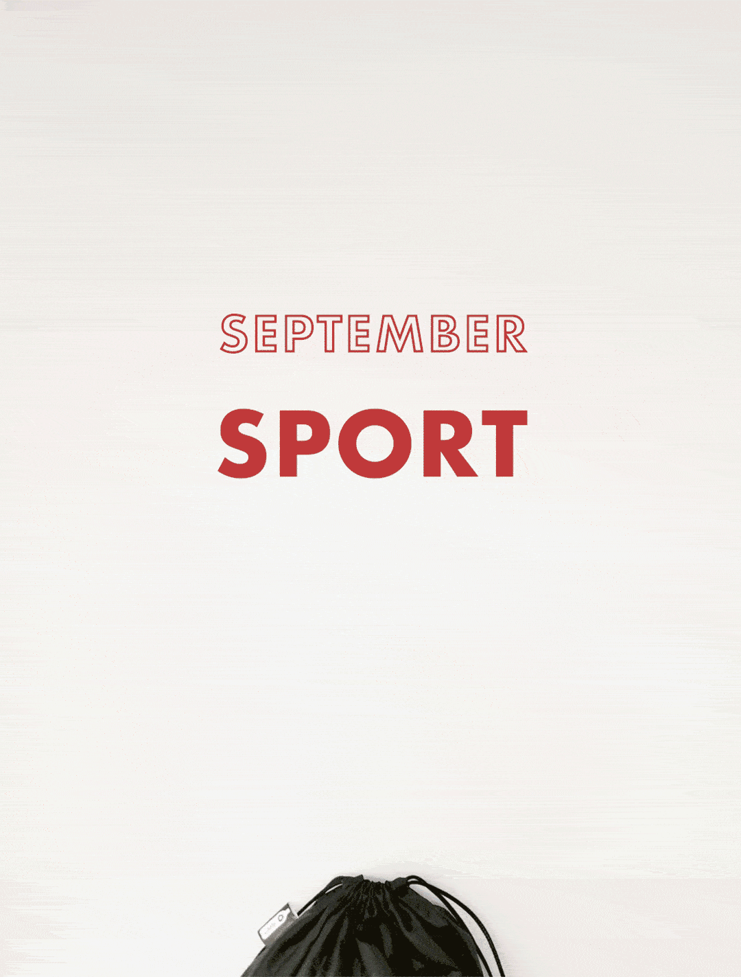
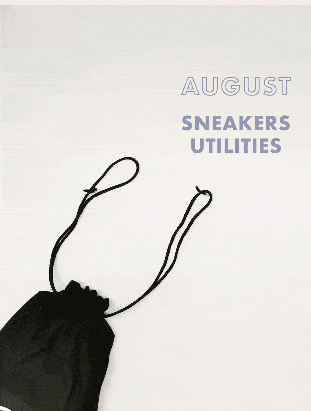
Application across reward merchandise
Logo design proves itself through application. For SKUP, primary application was custom bags, tangible rewards Stripers earn through demonstrated Nike product mastery.
We designed bag series featuring the SKUP identity prominently. These weren’t generic promotional items. Rather, they were desirable merchandise reflecting the achievement they represent. Quality materials, thoughtful design, products employees would genuinely want.
Beyond bags, we developed complete communication materials ensuring consistent SKUP presence across digital platforms, training modules, and physical retail environments.
Retail strategy through brand design
This Nike Foot Locker logo design project exemplifies how strategic branding supports retail operations.
Training programs require engagement. Visual identity creates that engagement by making abstract concepts tangible. SKUP transforms “learn Nike products” into “earn SKUP rewards”, shifting motivation from obligation to aspiration.
Moreover, collaborative brand identity reinforces partnership message internally. Stripers see Nike and Foot Locker united, which shapes how they present Nike products to customers. The logo becomes strategic tool beyond aesthetic object.
Corporate logo design expertise
If you’re developing training programs, employee engagement initiatives, or collaborative brand identities requiring strategic corporate logo design, VANDA brings expertise translating business strategy into visual systems.
We understand that internal branding isn’t simplified external branding. Instead, it requires different thinking about how visual identity motivates behavior, reinforces culture, and supports operational goals.
From Nike and Foot Locker’s SKUP to corporate initiatives worldwide, we create brand identities that work as strategic tools, not just attractive graphics.
SKUP Logo Design & Brand Identity
Client: Nike / Foot Locker
Branding & Design: VANDA Designers
Scope: Logo design, naming strategy, merchandise design, communication materials
Year: 2020
Typology: Corporate branding, collaborative identity, employee reward program
Explore our branding projects
Branding & Visual Identity Design | Build a Strong Brand
Design your corporate identity
Contact VANDA Designers | Interior Design Studio Italy

