REFURBY | Branding
When starting a new business, one of the most important things to do is to convey the values of the brand and its founders.
To do this more effectively, it is necessary to build a solid and consistent image associated with the brand, which is easily recognizable so as to become an element of the everyday life of potential customers who must feel attracted and then trust the brand.
In order for the company to be immediately recognizable it is necessary that all the communication tools that give life to the image are linked to each other by a relationship of mutual coherence.
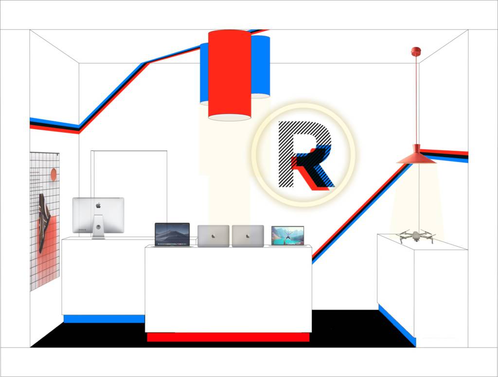
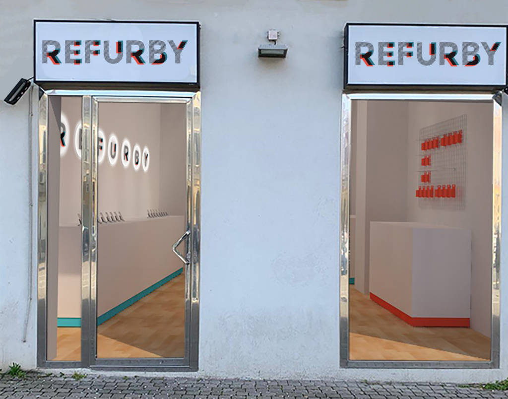
Once this is done, consistency between the online and offline worlds is even more important; when the customer physically enters the store, he must find the same language and confirm the sense of trust that led him to go there to take advantage of the services offered.
Moreover, in order to speak the same language as the consumer, it is of fundamental importance to define a reference target that is as clear as possible, so as to understand its characteristics and assess how best to reach it.
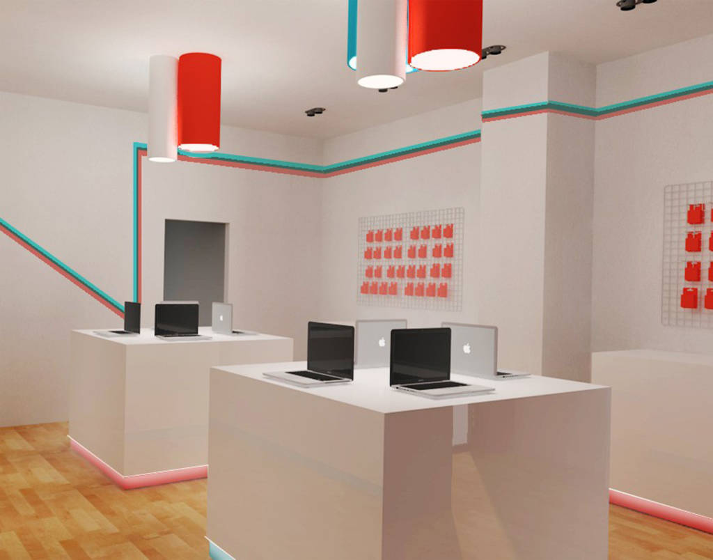
Refurby is the perfect example to understand how important it is that the physical store, the graphic presentation of the brand and the target audience are consistent. So this is the starting point when we create the concept.
Refurby is a startup that deals with reconditioned technological products and their goal is to make people understand that a second-hand product is not only a cheaper product but a real choice of conscious and ecological life.
A young brand, therefore, dynamic, attentive to choices that impact on the environment, which is aimed at those who love technology but understand that ethical choices at this time are fundamental.
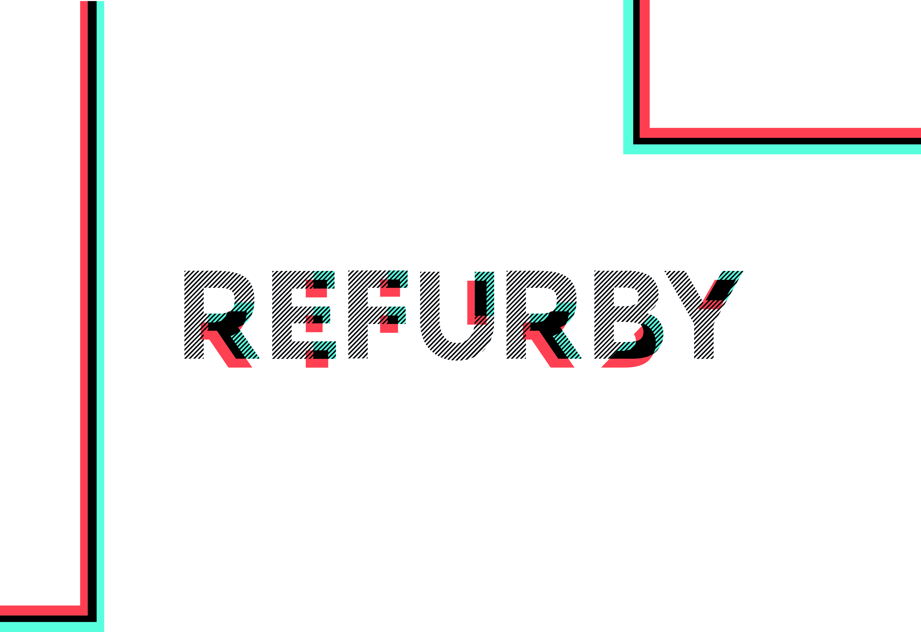
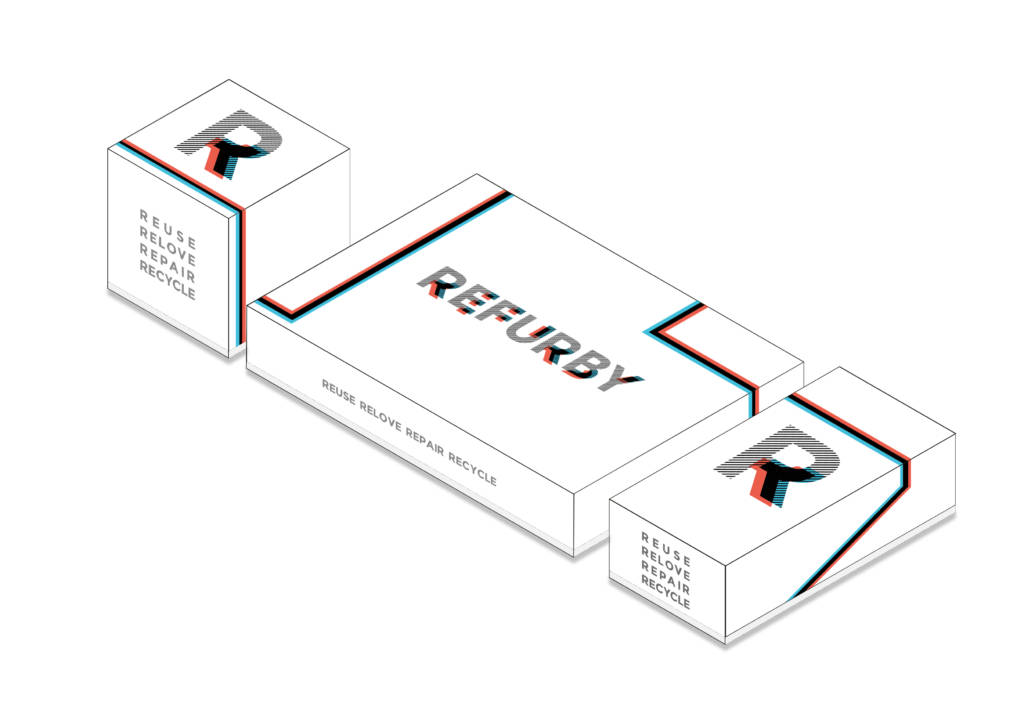
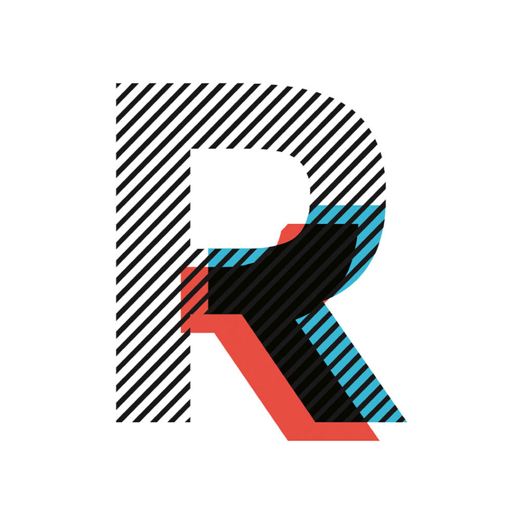
To convey Refurby’s message, we have designed a clear, strong, easily recognizable and fun logo. We used the effect of 3D superimposition, to wink at generations who saw the first films with red and blue goggles.
The same effect has been declined in several variations in order to adapt the logo to the entire corporate image and social media publication.
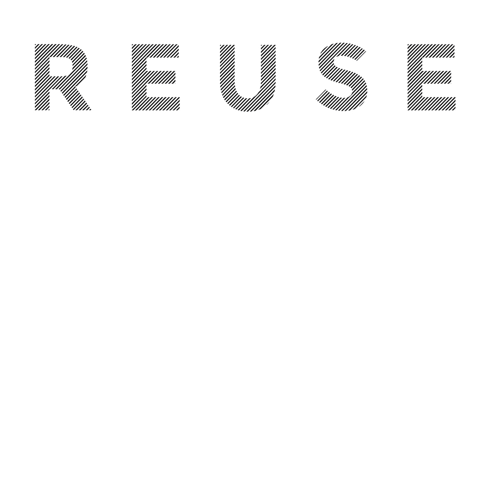
A logo may not be enough when you want to tell something more, especially at the beginning, so we chose terms to compose a payoff that immediately recall the values and objectives of the company: REUSE, RELOVE, REPAIR, RECYCLE.
In studying the concept of the stores, we started from this: the logo. As if the physical store were another, very important part of the coordinated image created.
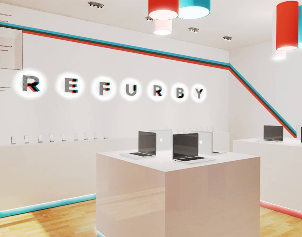
The company’s development plan provides for the opening of numerous shops throughout the peninsula.

Place: Milan | Italy
Designer:: Valentina Elmiger
Release Date: June 22, 2020
Category: Branding